

Sarah: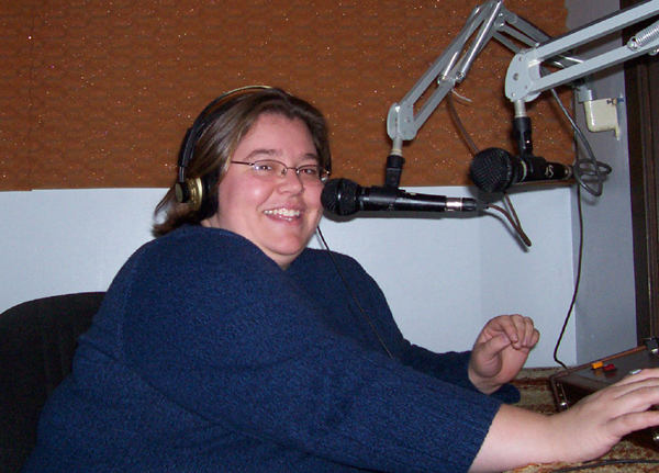 The first thing we did (and that which was the most fun) was create our radio spots. We had two sessions in the studio. The first time, Kevin couldn't attend, and so we had to improvise the male voice for the second radio spot. Alicja provided the base vocals, and then we played around with the pitch until we came up with something we could live with. It wasn't perfect (and therefore funny as hell), but it would do. Unfortunately, we had planned on getting the blog "corrupt.blogspot.com" rather than "corruptsurvey", but that plan fell through-after we'd already recorded our spots. So we went back to the studio a second time. We easily re-recorded both my and Melissa's voices saying the proper address and edited them into the spots. This time, we also had Kevin (although no Alicja), and we had him read the male part for the shower spot, which worked wonderfully.
I really liked the idea of the radio spots, partly because it was unique, partly because it was free, and also partly because I knew it would be almost impossible for the other groups to subvertise it without radio time of their own. I also put up two of our largest posters in the Student Life Centre, around the bannister in the food court. Upon seeing them up there, I would redesign them significantly, given a second chance. I would make the URL quite a lot bigger, and I would make sure the posters were trimmed properly (I didn't realize there was so much waste space on them until they were up), to name but a couple of major things. I put up some of the smaller posters and distributed some flyers around Toronto, as well. Again, on reflection, I would have made up some of the fortune tellers myself and distributed them, as well, given another chance. As it was, at the time I was simply interested in moving quickly through the subway trains and not getting stopped for littering.
Overall, I think we did quite well. Our group worked together nicely and we wound up with some good results. The radio spot was fun to make, and pretty much subvertisement-proof given the circumstances.
What might be interesting would be to have two projects throughout the term. I know I at least learned a lot just through this project that could very effectively be brought to bear on a second.
Kevin: I think one of the most important things our group did was follow the advice given in Pricken's book, Creative Advertising, to keep coming up with ideas and avoid settling on the first thing we come up with. So we ended up with flyers that can be interactive and interesting, rather than plain posters that people could dismiss easily, not matter how well-designed and rhetorically interesting they may have been. Although one of our ideas, to have an insert ad in Imprint, would have been really effective, it was too costly. And, I guess, the posters we did use ended up being effective, but I'm glad we had something interactive in our campaign.
In distributing flyers, I put them all over campus. I concentrated on areas that had a lot of computers, often just putting a few right in front of or next to them. I also placed them on stacks of Imprint and other campus newspapers, because that is where people go when they want something to look at. The ads I put there also did not get thrown out, and I saw some stacks slowly shrinking over the week.
In making the radio ads, for my part, I tried to make the ad funny, and have some buildup toward the URL so that people could remember it. But, having spent no money in this campaign, if we had known we would have been able to do that going in, we should have bought our own domain. It would have been easier to remember and more professional-looking.
I think the strength of our campaign was the wide distribution we created. Though we did not have a major attention-getting centerpiece like some groups, or face-to-face interaction, I think those things are not as powerful as a widespread campaign on limited resources. But I think having a major on-campus event or object, coupled with widespread advertising that connects with the event or object would have been very effective. But in choosing one or the other, I think we did the right thing with a widespread campaign with no major center point.
Alicja:
I designed the paper fortune advertisements, and distributed them in Waterloo, Kitchener, and Burlington. I constructed about 100 of paper fortunes, and left them on desks throughout the St Jerome, Dana Porter, and Davis Centre libraries sitting on their tear-off sheets with our website's address. I designed our webpage and "click here" icon, and installed Google Analytics. I did a lot of chalking throughout Kitchener and Burlington. I chalk-grafittied quite a few buildings... good thing chalk is non-permanent!
I helped out with our initial radio ad recordings, but in the end my computer-altered voice could not compete with Kevin's manly one. I sent out an invitation to our site to every single person on my Facebook friends list. Exhausting work THAT is...
I really enjoyed this whole experience. I'm very happy that I had the chance to work with Sarah, Melissa, and Kevin. I think we all worked really well together and because of that, the process went quite smoothly. I wish we had more time to continue with our campaigns, just to see how effective our marketing strategies were. Like professor O'Gorman said, I think what made this whole process so interesting was the fact that we didn't really have anything concrete to market. It really enhanced our creativity.
I'm happy that we chose to use a scatter-shot approach. As of Wednesday, we were in second place, which means that SOMETHING we did had to have worked.
All in all, this was a really unique and interesting experience for me. It would be nice if other English courses offered the same type of hands-on interdisciplinary projects as this one.
Melissa: I coordinated and booked studio time at the radio station. I wrote three different radio scripts and, together with the group, decided which we should go with. Additionally, I did a pretty extensive chalking circuit around campus and around KW. Originally, I started doing the ground, but with the snow we ended up getting, I instead found classrooms. I went out postering with the 11X17 “Are you Corrupt?” poster designed by Sarah. I targeted computer labs on campus, the PAS building, Hagey Hall, and the Applied Health Sciences building. I affixed the poser anywhere I could, from washroom stalls to food booths using heavy duty packing tape.
Also, I did the Facebook route and went to many of my friends to ask for their help to click our link.
Additionally, I took our cootie catcher flyer and distributed it around key Laurier lounge locations (the Dining Hall, Concourse, and Solarium). I even saw a few groups use the fortune tellers. Unfortunately, I didn’t have a camera at the time.
I think that we did very well with the resources that the group had. We were able to do our campaign for zero costs thanks to connections our group had. I also wished we book the radio ad spots to go until Friday as it was a key part of our campaign. I’d be surprised if we will get very many hits to the site after Wednesday.
I wish that the flash mob we wanted to plan was feasible. 
Also, I suppose that it would have benefitted us to have a brand or a logo for our campaign. I guess I kept remembering O’Gorman asserting that the hits to the website were much more than the design process and I think that shows with our web design. It’s very clear what we want our target audiences to do. A special thanks to Alicja for developing our blogsite strategy.
Overall, I’m happy with our campaign. I’m proud to say that as a group we didn’t use dirty tactics against the other groups. We worked well together.
30.11.07

22.11.07

20.11.07
Kevin - Site Remix
So yeah, I changed the site a little. It's surprisingly easy. Tomorrow night I'll trim a lot more stuff. Don't worry, I won't delete anything, but I'll make the archives and stuff invisible so that when people come to the site, it'll just be a message saying to go to Dane's site. I may also make the site look more like Dane's so people don't feel like they've been redirected somewhere else entirely. But I figure this site won't have enough content to really qualify for being marked, so those marks will go into our other stuff.
Kevin - UW Ad Campaign
Yeah, that campaign bothers me too. I just think it's a dumb quotation that everyone uses when they want to seem like a cool visionary. I see it in online discussions all the time when someone is proposing a dumb idea, or talking about how they're outcasts because they "see things differently."
But I think Waterloo's most effective advertisement will be its rankings in Maclean's Magazine. I think I remember someone telling me that it was the president of UW that suggested the "best comprehensive university" category because he knew we would win it, and we weren't winning any of the existing categories. If that's ture, then that's very shrewd marketing.
Melissa noticed a subvertisement on the bus yesterday
I was on the bus yesterday and there was a sign that read: CHASTITY! The choice of the new generation.
Underneath "chastity" in black marker was the word "sucks" and the tag line was transformed into "the choice of the religious agenda". If only I had a camera...anyways, I had a giggle. Since this class I'm noticing stuff like this a lot more.
17.11.07
Melissa asks: What’s with UW’s 50th Anniversary campaign???

This marketing document should be of interest to my fellow students in this course as it contains UW’s positioning statement, style guide, and strategy for the 50th anniversary: http://anniversary.uwaterloo.ca/documents/50guidelines7.pdf
It’s the kind of document that says a lot without really saying anything. For a school that prides itself on “innovative culture”, I wonder about whether the branding actually reflects the attitude. Personally, I don’t think this ad campaign is effective or innovative at all. The copy: “the spirit of “why not?”? C’mon?? Seriously!??! That’s all they could come up with? That sort spirit evokes disturbing images within me. Like scientists creating bombs or virus strains, kids pulling the legs off of spiders or stomping frogs to see which way the guts will come out. Basically, for me it makes me think of people doing things just because they can in an immoral sort of way. I understand they mean it in a George Bernard Shaw way, but it leaves some much room for personal interpretation. What’s worse is the hideous image for the campaign. It certainly does not correspond with the text. I’m sorry if I sound traitorous, but what does the mace, staff, specter thing have to do with anything?
On page 7-8 of the pdf file, you can see the lengths in which they have gone to launch the campaign. Money spent on items such as pins, podcasts, stickers, balloons, all letterhead and envelopes, etc. and ad nauseam. I only imagine the end price tag, but whatever was spent, it was too much. They could have done something much more effective to celebrate the school’s 50th anniversary. I bet that as a class, based on everything we have learned, we could have come up with an idea far better to invest resources into. But that’s just one person’s opinion. What do you have to say?
Do you like this ad campaign?
Do you think the qualities in the distinguishing traits section (Connected to the world, Future oriented, Innovative, High quality ) represents our school accurately?
How much of your decision to come to UW was based promotions and marketing efforts?
14.11.07
Radiohead - Reckoner
This is somewhat random, but I felt like posting a video of one of my favourite songs off of the new Radiohead album entitled "Reckoner". It's footage from a webcast they had a few nights ago.
For those of you not all that familiar with Radiohead... they are awesome. Go download their album for free.
I guess I posted this because it ties in somehow with our Radiohead discussion a few weeks ago...
but ultimately I blame Professor O'Gorman for playing the album at the beginning of class and getting their songs stuck in my head.
Hope you all enjoy and eventually partake in their controversial dissemination of free music.
- Alicja
12.11.07
REMIX of Melissa's Moral Meter logo

Based on Dane's comments, I un-busy-ified the logo.
I also played around with the figure and ground to add some more visual interest.
It was beyond great to get his feedback.
Sarah's Thoughts on Branding
I think I had been peripherally aware, at least, of the media's tendency towards "branding" rather than advertising a product. I clearly remember in the 80's preferring to drink Coke over Pepsi because I liked Coke's much more inclusive image better than what I perceived as Pepsi's "cooler than thou" approach. I couldn't tell the difference by taste, but I could by corporate image.
Although I knew on some level that companies promoted brands over products, I didn't think they were all that blatant about it until I watched some tv last week. There was an ad for some pet store or other that came right out and plainly said they were having a "Brand sale". Brand name pet foods, all on sale.
We see the interior of a house, at the front door. A man walks in and looks around. He calls "Mister Barky Von Schnauzer?" No answer. He tries again: "Mister Barky Von Schnauzer!" Still no answer. Voice over: "GIVE YOUR DOG A NAME HE ACTUALLY LIKES!" And then it launches into its pitch for their Brand-name sales event.
I find it ridiculous that my dog would care what name brand her food is, but the ad clearly urges people to take their pet's opinions into consideration (and it conveniently lets us know what those opinions are, how thoughtful of them). I doubt I even would have noticed this had it not been for the Klein readings of last week, but like a film course will destroy a person's enjoyment of movies, this course is at least making me much more aware of advertising and what they're actually doing.
9.11.07
An Anecdote from Melissa - The day I became Naomi Klein

In the summer of 2004 I was at a social justice retreat at Camp Arowhon in Algonquin Park. We were playing an ice-breaker game on the first day where people were all given labels on their backs of the names of people, normally people use celebrities, but in this case it was social justice advocates, environmentalist, lefties, grassroots leaders, revolutionaries etc.
So there I was in a large group of about 100+ people mingling while asking yes or no questions to gain some clues about the person’s name that was affixed to my back. And people were asking me questions about who they were supposed to be. There was David Suzuki, Ghandi, Maude Barlow, Augusto Boal, Martin Luther King Jr. and so forth. I seemed to know everyone in the room. After asking multitudes of obvious questions about my person, such as, “is this person a man?” or “am I dead?” or “is this person on tv?”, I was still drawing a complete blank.
About 45 minutes later everyone but me had guessed who they were supposed to be. Being kind social justice people, many people wanted to help me solve the mystery. I had a cluster around me trying to give me hints. One whispered “She’s a writer”. I heard from someone else, “She wrote No Logo” . And someone else said, “Her husband is Avi Lewis”. Nothing. Nada. I had no idea.
Desperately, I was shrugging my shoulders and feeling a little sweaty. My eyes were darting around anxiously looking for an exit, a bathroom perhaps. I felt that I was not making a great impression on these people and I was hoping to network with many of them over the course of the retreat . At the time, I couldn’t remember ever feeling so stupid. The answer seemed so obvious to everyone else. I finally admitted to everyone I didn’t know who I was representing. A group in unison groaned the answer, “Naomi Klein”. They sounded just as frustrated with me as I am of them. I could of sworn that I thought I saw someone roll their eyes (I think that’s when I learned that do-gooders can be such snobs sometimes).
So, yea… the game doesn’t exactly work if you didn’t know who the person was, but from that moment on I thought that Klein was definitely someone I should know, especially since I was in my “social justice advocate” phase or what my friends call my green period. I’m glad we were able to read No Logo in the course as I never did get to read her. As soon as I got home from that social justice retreat I went to the library to check No Logo out. Sadly, it was taken and there was an 8 month waiting list! I kind of got busy with life and forgot to read the book. After that small and humbling experience that summer, I will NEVER forget who Naomi Klein is, that she wrote No Logo, and that she is an important contemporary writer who has many fans amoung the social justice circles.
8.11.07
Melissa's Moral Meter Logo

So that's my logo. Hope Dane likes it. I noticed that he uses a lot of black and white line drawing images along-side bright punches of colour. I wanted a logo to reflect that. The Meter text has a computer-ish vibe to connote the "analytical and scientific" aspect of measuring. "Moral" is chunky and eye-catching, but the "O" is a different font (magneto) because I wanted it to look like a head with hair in order to give him a slick personalty since he is so bold as to expose himself.
I wanted to try to put a meter aspect to the logo by adding tics to make it look like a vector graph, but it was just to visually busy. So instead I centered the man in the middle of a 3D empty space because I wanted to represent a universe where he could be potentially position anywhere once the moral meter was performed. The image of the man is split in two for the same reason, that he could go either way morally. Having the "M" for meter represent sexuality of the man provides a moralishness as sexuality and its expression is a common subject in moral debates, although it's not the only one.


5.11.07
Melissa's Remix

Remixing was a lot of fun...Some of you may or may not be familiar with the brand, but it can be found in most health food stores in the city.
Some of my challenges were:
1) that the product-line of Seventh Generation is not as well known as the mainstream brands, so I had to rely on text to convey much of the content
2) Seventh Generation is one of the few companies out that seem take social responsibility seriously. I felt a little traitorous revealing their darker side with major help from our reading. At first glance, they appear to be authentic transmitters of a necessary and needed messages. Yet, the spectacle still exists. And what a spectacular spectacle! IF they are not simulating the need for their product, they are busy comodifying the "revolutionary" identity right or even commodifying indigenous culture by means of hard-core appropriation. To top it off, they actually use grassroots, subversive, and SI-esque media tools, such as blogs, videos, and theater activism to name a few, to even though they are a national brand selling at Target locations since 2004 (and probably soon to be walmart). And of course they promote their products as the only alternative for the the necessity of survival, such rhetoric Sadie Plant warns us about. And we all know that Baudrillard says once the message is taken up by the media, the true message is watered down and/or eviscerated.
3) Some products are not as great as they could be in an ecological way, although work their PR people/mini consciousness industry diligently try to deliberatively sway consumers. This is why I used the tagline: Think about the true ecological costs. It's one thing to go into a store and pay more for an eco product and think that you are a guilt-free ecowarrior. What about using vinegar and elbow grease in your toilet instead?? Also, they sell disposable paper products and diapers. How about use a reusable rag or diapers? It seems that despite best attempts to convince people otherwise, Seven Gen values CONSUMPTION over CONSERVATION and SUSTAINABILITY. Many of their plastic bottles are not made from recycled materials. They do not use the most social responsible shipping methods due to locations of distribution centres (they say they are working to improve it though and have recently added more rail lines). Also, they even settled a dodgey lawsuit out of court over whether there diapers were actually chlorine-free or not.
In the end, they got some great messages and products -at least far better than 99% of everyone else, but there is still insidiousness afoot. Although it seemed a like a last and desperate hope for my quest in actually finding a authentic consumer product within this capitalistic system, I can now go home to my natural mint smelling house at the end of the day and feel nothing but meaninglessness.
31.10.07
Alicja's final subvertisement

After recieving the mark for my first ads, I decided to change some of the design elements to make my remixed ad clearer. I exchanged the chicken for a duck (since the product is for hunting game birds), made more of a contrast between it and the background, and added a word bubble to clarify who's speaking.
30.10.07
McDonald's Subvertisement - Kevin Gerry
Alright, here's my final ad. Quite different from the original draft I made. I ditched the whole "future" thing because it was too complicated and I think it's better that this looks more like McDonald's' regular advertising.
The font I used is copyrighted and would have cost like a hundred dollars to get. I used the sampling feature on the site that had it and took screenshots and cropped them and it was just a giant hassle. But it is one of the companies main fonts, as you will probably recognize.
I used a full bleed image to get across the idea that the food is "bigger" than it is. And I put the food's unhealthiness in terms of calories and nutrients, since that's what's popular recently. If this were a few years ago I'd probably have something about the cholesterol.
I think subvertising McDonald's is something that the SI would approve of, McDonald's is certainly an example of capitalist spectacle.

Alicja's second subverted ad

I definitely think this is a more effective ad than the other two. I tried to maintain the light-heartedness of the original, only because most people who look at PETA ads are usually immediately dismissive due to their in-your-face style.
What do you think?
29.10.07
Alicja's Subverted Ad's


Blegh.. it's been forever since I last posted. Between having my wisdom teeth out last week and having some sort of crazy throat illness this week, I haven't been the best of bloggers. Ah well.
I've been tinkering around for a while now with my ad, and I think I'm getting close to the final subversion.
I'm super sick right now and I don't particularly feel like going into great detail about my ads. I think the first one is the better of the two... it gets more to the point I suppose.
They're kind of ambiguous, but hopefully everyone will get the point. If not, please let me know. Any comments or suggestions would be totally appreciated.
26.10.07
Melissa's musings on last class
I was so impressed last class at the caliber of advertisments my fellow classmates have produced. It's exciting to be in a class where so many people are participating with lively and thoughtful discussions.
I did not see one person with glazed eyes in class. Everyone seemed engaged with having a good ole learning time.
DOWN WITH APATHY!
O'Gorman might make situationalists out of us yet.
24.10.07
Subvertisement - Original Mix! - Kevin Gerry
So instead of subvertising my kickstart ad, I am doing McDonald's.
In this ad, I went for a sarcastic approach. So this could be taken as a pro-McDonald's ad at first (though it doesn't really fit in with the generally white-backgrounded style of their own ads) though the fact that one meal contains an entire day's worth of calories as rather suspect as an example of futuristic efficiency.
I thought of another ad, though I don't have time to put it together. It would actually be pro-McDonald's (since they are so widely hated, advertising FOR them also counts as being subversive). The ad would basically be about the fact that the restaurant offers healthy menu items as well, and you won't get "Super Sized" if you have some self-control.

23.10.07
Melissa is kickstarting her kickstart


Hi all,
I've been sick as sick can be and behind with homework and work work, but here are my two kickstart ads.
I was originally going to do some "double-dipping" and do ads for my weekly radio show on CKMS FM 100.3 FM wednesdays at 5 (a little plug). It wasn't really working out, so I chose a non-mainstream natural cleaning product from Seventh Generation -specifically, their toilet bowl cleaner.
I welcome any feedback.
Special thanks to my group for being so helpful and understanding while I was sick.
21.10.07
Sarah's Kickstart Remix ad -- Draft 1
For reference, here is the original ad I created:
And now, the "Remix":
It took me forever to get the font just right. I tried to use the "Tide to Go" logo and turn it into "Find out." It wasn't all that difficult to do -- in theory. In practice, it took a lot of fiddling with pixels, because my talents simply don't lie in that direction.
I took the T and turned it into an F easily enough. I just chopped off the first half of the crossbar and pasted it onto the other side of the stem. I made the N by taking the stem of the I and a portion of the D and pasting them together. The "out" was similarly simple: I already had the O and the T, and just needed a U, which I made by copying the whole of the O, erasing the top portion, and adding on the little serif-like flourish from the T for the stem.
Easy in theory! But it took a lot of pixel-fiddling to make it look even somewhat natural, and I'm still not 100% satisfied with it. I may fiddle some more later, but right now, I think I'm going cross-eyed, and I'm going to give it a rest for a bit.
The font for "Do you know what chemicals you're using?" is a simple Ariel font, the colour taken from the outline of the hand in 'panel' two.


17.10.07
Alicja's Kickstart Advertisements
The product I chose to advertise is called “Season Shot”. In essence, these “Season Shot” shotgun shells consist of tightly packed seasoning, which are encased in a fully biodegradable shell. Once a bird is shot, the shotgun shell explodes and distributes seasoning throughout the bird’s entire body. This means that the bird can go straight from the field right into the oven! Also, there is no need to de-bullet the bird because the shell is made of biodegradable food product, meaning dinner preparation is a fairly simple task. 

Sarah's Kickstart ads


Apologies for the quality, here. I had to resize them to get them to fit nicely on this layout. If you right-click and choose "view image," you'll get a better image.
Melissa -SHARPIE ad from Oct. 10
Hi again,
Double bad news. I did the sharpie ad and sent it to the classlist last week *which, by the way, I shouldn't have done...a very poor example of following directions BTW. You can imagine how embarrassed I am :$ * . Anyways, it was a picture of a dog balancing a sharpie on its nose and the copy read, "Brilliant" with the letters in different colours. In place of the "I" there was a red sharpie marker. I made the layout asymmetrical to a activate the space and utilized a red background to match the colour of the pen on the dog's nose. Anyway, I don't have an example to share for the blog because it's not in the format I needed it to be in my sent mail. Apparently, when you send big files through @uwaterloo.ca, they strip the attachment. So nada example to show you all --UNLESS, you still have the email I stupidly sent to the class list. If you have it still, would be able to email it to me at msirelan@uwaterloo.ca. I would be forever grateful....
So, I don't have it, but if you were on the class list you probably had already seen it, actually two different files of it.
Also, weirdly enough, Prof. O'Gorman told me that someone else had the very same concept design as me with the same pic and the same tag line. I couldn't believe it!!! I would like to see that in class today. Originally, I found that pic when I googled the word "sharpie" and I picked that photo because it looks like my dog, Bailey. Also, it was a higher res pic as well. In terms of copy, I examined many different options using an online thesaurus for "sharp" and "smart". I picked brilliant because of the dual meaning of colour and intelligence. It's so odd that someone else did too. Perhaps the same muse sat on our shoulders. Great minds think alike and all that...
Also, here's the link for the pic of the dog so that you can better visualize what it was like.
LASTLY, I'm sorry I filled everyone's inbox with my ad.
Melissa -Gu Ad

16.10.07
Kickstart Ad #2 - Kevin Gerry
This is my second ad. I had a few issues with the fonts. I was looking for a font that would match the thick and jagged lines in the image, but didn't find one. Does anyone know of one that would be appropriate? I suppose the one I used now is okay, it's just contrast intead of unity.
For this ad, I used the kickstart concept of turning a proverb (if you call "believe in yourself" a proverb) into its opposite. I tried to create unity in spacing the words, like we did that time with the grids in class. I also tried to "balance fullness with emptiness", that is, the fullness of the image with the emptiness behind the text.
Also, in a perfect world, the logo in the bottom left corner of the image would not be there.

Kickstart Ad #1 - Kevin Gerry
This is my first ad for the kickstart project. It's for an animated series called Gurren Lagann. It's actually pretty complicated to get screencaps. "Break the heavens" is one of the catchphrases of the show, but I guess it's not much of a rhetorical device. I was focusing more on design aspects with this ad. I just thought the image I used was striking, I guess, and went from there.
Any thoughts?

10.10.07
Alicja's One Word Advertisement

For some reason I can't upload my image with the Blogger image loader, so I've had to resort to using HTML. Because I'm terribly rusty with HTML, I can't quite format the picture the way I'd wish. However, I'm sure all you avid viewers get the gist.
Sarah's One-Word Sharpie ad, and Group Three ad for Repitition
We also decided that this qualifies as an example of repitition, where the product appears more than once in the same ad.

3.10.07
Kevin Gerry -- Online Surveys
I have found online surveys to generally be boring to fill out, and their results fall into two categories: results that are so vague that they would be correct about almost anyone, or results that are incorrect. Occaisonally there may be a survey that asks you if you have a certain personality trait, and if you say that you have it then it will helpfully tell you that you have it.
Nearly all the online surveys I've found fall into the category of "What kind of ______ are you?"Giving results telling you something about your personality in relation to some fictional character or household object or something. There are also a few that are "How much do you know about _____?" which I suppose would actually be more useful if one wished to know how much they knew about a subject, compared to how much they thought they knew.
Sarah -- Blog entry about surveys
My main experience with online surveys are either the fun internet quizzes (such as "What Harry Potter character are you?"), or the occasional customer survey I consent to do. I even sometimes seek out the latter type if I've had a particularly good or particularly bad experience with a company, just to let my voice be heard in some way, although truth to tell, I never think it'll make much of a difference. It makes me feel better, though.
One of the things that most irritates me about surveys (excepting the ones for pure entertainment) is that the questions are either so exhaustive in an attempt to be as inclusive as possible or they don't have an answer I would like to use.
An example of the former problem is that of gender: I've actually seen questionnaires that list about ten different possibilities for identifying one's gender; male, female, transgendered (male-to-female), transgendered (female-to-male), transgendered (male-to-neutral), transgendered (female-to-neutral), intersexed (identifying male), intersexed (identifying female), intersexed (identifying neither or both), or "prefer not to answer." Surveys that attempt to incorporate every single possible answer are exhausting to read through.
On the other hand, surveys that don't offer enough choice are maddening in and of themselves. One survey I took frustrated me so much I simply quit taking it, and it was only asking for my marital status. Was I a) single, b) married, c) divorced, or d) on a second marriage? Considering I am not single, not married, not divorced, NOR am I on a second marriage, I had no idea how to answer, and thus quit the survey in a fit of pique.
There's a real balancing act to making a survey that is both complete (and thus useful to the data-gatherers) and easy to take without either boring or irritating your subjects. For those quizzes that are for entertainment purposes only, the "rules" can be fudged a bit. I don't mind being asked a question about something I would ordinarily consider inapplicable if I'm taking the "What Disney villain are you" quiz. If I'm taking a customer survey, however, I don't want to be too tightly pigeon-holed.
2.10.07
Survey Questions
1. How do you like your PEI potatoes?
- baked
- fried
- boiled
- scalloped
- mashed
- curried
- fried green potato
- raw
- intravenously
2. How many servings of PEI potatoes do you have a day?
- 1
- 2
- 3-5
- 6-10
- My life is a constant parade of potatoes
3. What do you like on your PEI potatoes?
- butter
- sour cream
- bacon bits
- cheese
- garlic
- more potatoes
- steak
- chocolate chips
- hot fudge
- turkey
- all of the above
4. Have you named your children after any PEI potatoes? (e.g. Russet, Yukon Gold, Shepody, Norchip)
- Yes
- Not yet
5. How would you describe your latest potato experience?
- fantastic
- awesome
- transcendent
- orgasmic
- I did not have PEI potatoes
Don't forget to visit the Prince Edward Island Potato Museum!